
PROJECT
MY ROLE
PERSONAL CONTRIBUTIONS
TOOLS
One of my recent UX projects involved redesigning the main website for AUTOPAY, a business-to-consumer (B2C) company, as well as designing a proposal for a new website for its parent company, The Savings Group, a business-to-business (B2B) organization. The challenge was to create two distinct websites that would appeal to regular consumers and financial institutions looking to refinance their loans. To achieve this, I performed extensive research and created visual mockups for both sites, utilizing the design thinking principles of Empathize, Define, Ideate, Prototype, Test, and Implement.
The primary objective of the AUTOPAY website redesign was to enhance the user experience, make it easier for users to find relevant information, and encourage them to proceed to the refinancing application form. Meanwhile, the main objective of The Savings Group website redesign was to attract lending companies to become partners of The Savings Group brand. In addition both websites needed to adhere to its own individual Brand Guidelines, which I personally created on previous projects.
1) Understand - Empathize
2) Understand - Define
3) Explore - Ideate
4) Explore - Prototype
5) Materialize - Test
6) Materialize - Implementation
To address this complex problem, I employed the design thinking methodology to find the optimal solution. By empathizing with the users and stakeholders, defining the problem, ideating solutions, prototyping and testing the design, and finally implementing the solution, I was able to create a well-designed, user-friendly website that met the needs of both companies' audiences.



To better understand the needs of the users and the business goals, I conducted a comprehensive research process. First, I interviewed customer service representatives, Fulfillment teams, and managers to gain insights into the challenges they faced. Additionally, I reviewed Quality control recorded calls from actual customers who provided feedback about their experiences with the service and usage of the main website. Through these interviews, I discovered that many users were coming to the website with questions about how to start a refinance process. They were seeking information on the refinance process and also the regular vocabulary used when completing an application. The customer service team also reported challenges with the website's outdated interface, leading to long wait times for customers.
In addition to the interviews, I also performed secondary research, created personas, and conducted a competitive website audit analysis. This analysis involved looking at multiple websites from competitors to understand their approach, with a focus on how they presented information to the user (such as vocabulary, color, layout, and call to action). By combining these insights with the design thinking principles, I was able to develop a comprehensive solution that addressed the needs of both the users and the business goals.
After conducting extensive research, sharing findings with product and marketing team, and reviewing analytics, we discovered a high bounce rate of 70%. We concluded that the lack of information clarity and outdated appearance was likely the primary reasons for the low engagement and high bounce rate on the site.
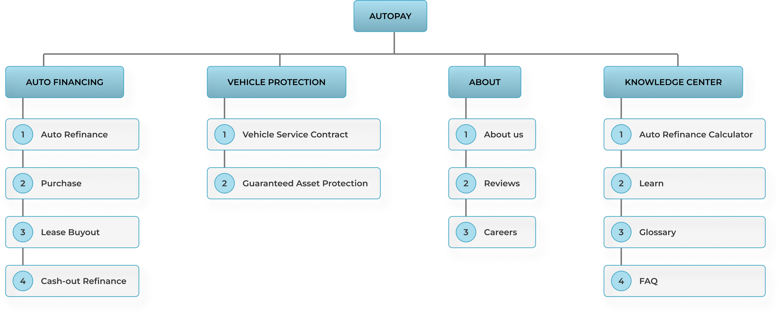
To address these issues, we aimed to simplify the way we presented information to the user, making it more compact and digestible. Specifically, we aimed to revise the vocabulary to be more accessible and avoid overly technical language. By prioritizing these changes, we hoped to improve the overall user experience and reduce the bounce rate on the site. To complement my initial research I proposed Sitemap and User-Flow for the new site with the feedback and collaboration from our Product and Marketing Team.
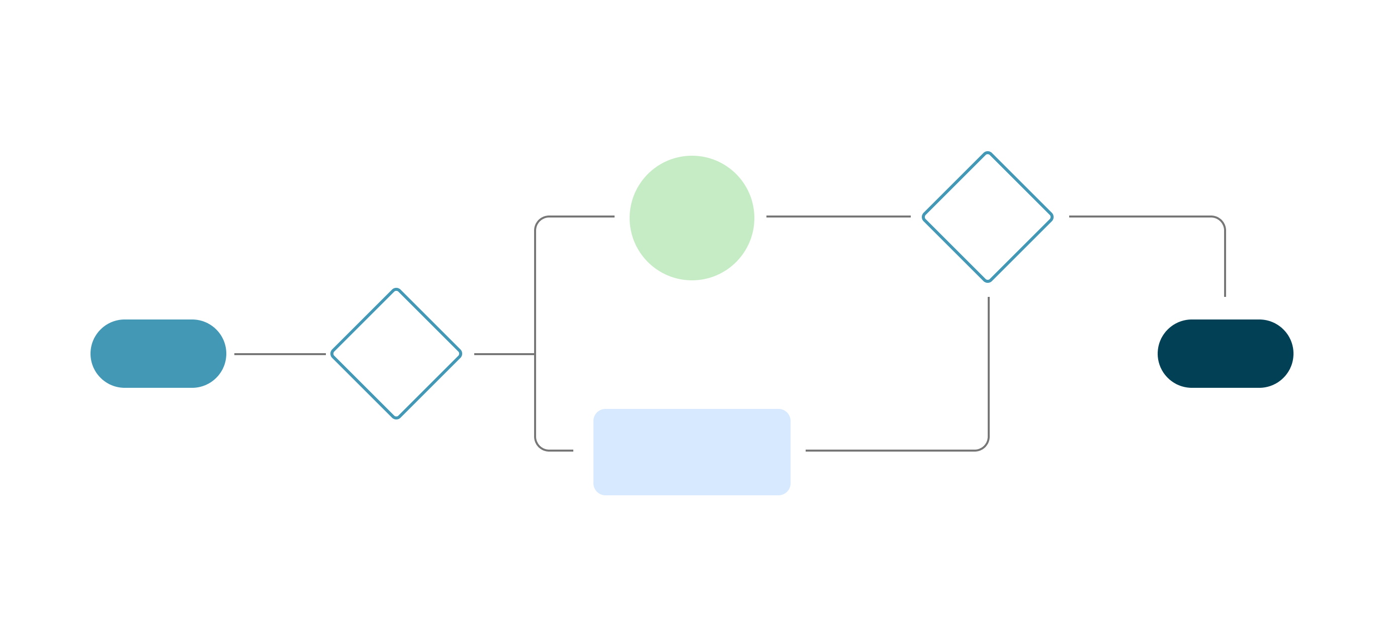
During this phase of the project, I collaborated closely with various team members, including Developers, Copywriters, Marketing Managers, and Product Managers. It was important to ensure that everyone was on the same page and that their input was taken into consideration. Specifically, I focused on three areas:
1.- Ensuring that the wireframe designs for both companies (AUTOPAY and The Savings Group) were feasible for Developers and that they would not encounter any challenges during the development process.
2.- Working with Copywriters and Marketing Managers to ensure that the website layout and the positioning of images and copy sections were optimized for user engagement and conversion.
3.- Keeping the Product Managers informed of the project's progress so they could start thinking about how to divide the work and create appropriate tickets for the entire team, including Developers, Copywriters, Marketing, and content creators. By collaborating closely with all team members, we were able to create a cohesive and effective product.
For this stage of the project, I developed high-quality mockups for the revamped AUTOPAY website and a proposed website for the parent company, The Savings Group. Drawing from the insights gathered during research and feedback from the team during ideation, I provided multiple wireframe options and high-fidelity mockups for both websites, with a focus on enhancing the ease of use, clarity, and overall flow of information. Through careful attention to detail, I ensured that the website designs accurately reflected the goals and needs of both the users and the business.
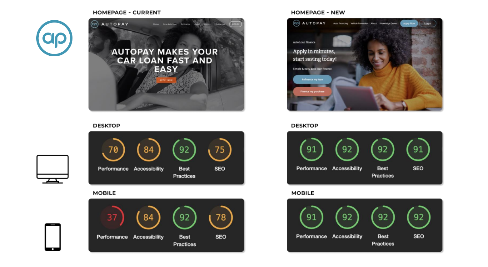
After presenting the final mockups to stakeholders and receiving approval for developers to create the website, we conducted a performance test to compare statistical data from the current and redesigned website. Upon collecting and analyzing the numbers, it was evident that the new website outperformed the original. Bounce rates decreased from 70% to 30%, and engagement increased from 50% to 110%. These results demonstrated that users were able to navigate and understand the website more efficiently, leading to increased engagement and higher rates of refinance application submissions. This successful outcome validated our initial research and ideas, and we were pleased to have created a more effective user experience for our clients.
The final step was to replace the old website with the new one and ensure that the new website was properly maintained. To minimize website downtime and potential crashes, we performed the switch on a Friday night, based on previous data indicating lower traffic during these hours. We closely monitored the website throughout the weekend and thankfully, no problems were reported. Throughout the following weeks a series of updates were performed to improve aesthetics, usability, performance and website navigation.
Additionally, based on this project I was asked by the Management team to Developed, Design and Produce actionable and responsive AUTOPAY landing pages through Unbounce.
By utilizing the design thinking principles, we were able to improve the refinance website's usability and user experience. The redesign resulted in a 40% decrease in the bounce rate and a 60% increase in engagement and conversion rate from the site to the actual refinance form, leading to increased application submission forms for the company. The customer service team also reported a positive user feedback, resulting in an overall positive impact on the business.
For the proposed website, I used the information and data collected from my research on the AUTOPAY website. Based on this, I presented multiple wireframes and high-definition mockups to the CMO and CTO. They received the proposal positively and were interested in moving forward with the new designs. However, due to company reorganization and reallocation of assets, the project was put on hold. Despite this setback, the stakeholders agreed to maintain the design for future development.
The final step in the completion of this website was to test the prototype, this is where I had to let go of the project. Unfortunately, due to the pandemic, the plans to move forward with future testings and revisions had to be put on hold. Nonetheless, the team was very pleased with how far I was able to take the project in a matter f months. I was personally pleased with the designs, as I feel I was able to accomplish what I set out to do.
Thank you for reading, hope you enjoyed !
Marcelo
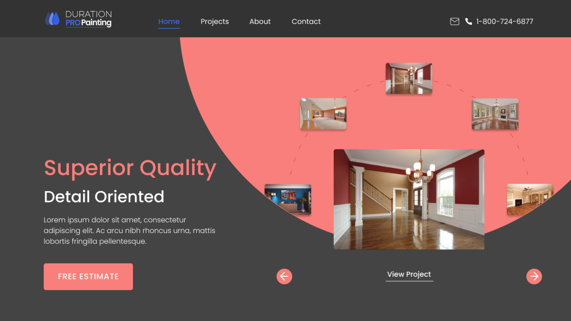
ProPaint - Freelance Project
Figma, Sketches, Wireframes, Mockups, Prototype
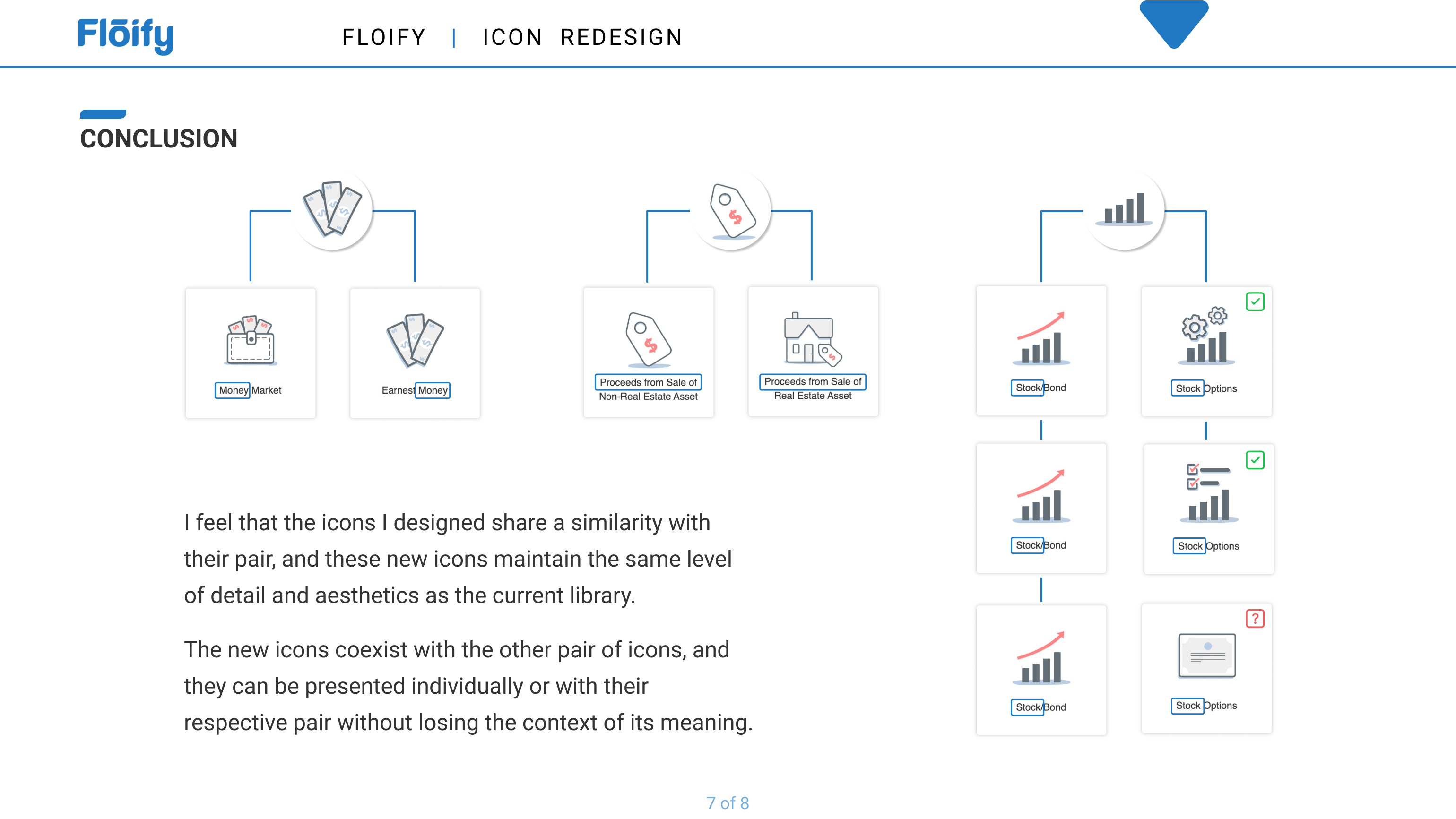
Floify - Design Process
Figma, Ideation, Sketches, Analysis Presentation

Undercanvas - Karsh Hagan
Analytics, Usability Testing, Personas, User Flows, more...